Client & market
The Good Bowl, Lebanon
Freelance, 2024
My role
Everything, end to end: name, identity, illustration and packaging
Scope
Naming, logo, colour, pattern, hand illustrations, packaging for two product lines
The brief
A new range of healthy food products for the Lebanese market, in two lines: baking mixes for brownies, cookies and pancakes, and a healthy cereal range like corn flakes.
The products had to feel healthy, tasty, fun and appealing at the same time, and stand out on a shelf full of competitors. The goal was to be the easiest and fastest answer to a quick healthy meal.
My role
What I did
Named it
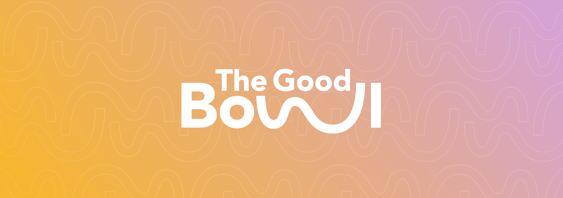
I chose the name The Good Bowl: simple, warm, and a promise in three words.
Built the identity
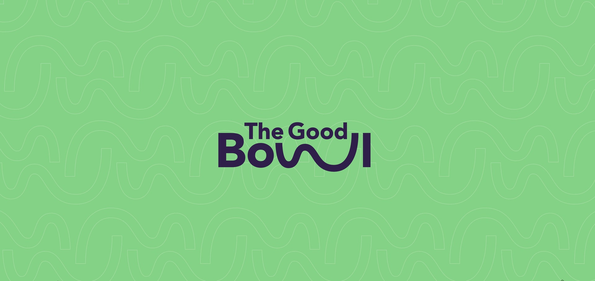
I designed the logo, the W-bowl motif, the colour palette and the pattern that runs across every touchpoint.
Drew and packed it
I illustrated the hands myself and designed the packaging for every flavour in both lines.
The Idea
A healthy diet doesn't have to be a pain
Healthy food often looks strict and joyless. I wanted the opposite: bright colours, soft organic shapes and a brand that feels easygoing. The organic look says how easy it is to make a meal from the product, and how fun a healthy lifestyle can be.
01
The name & the logo
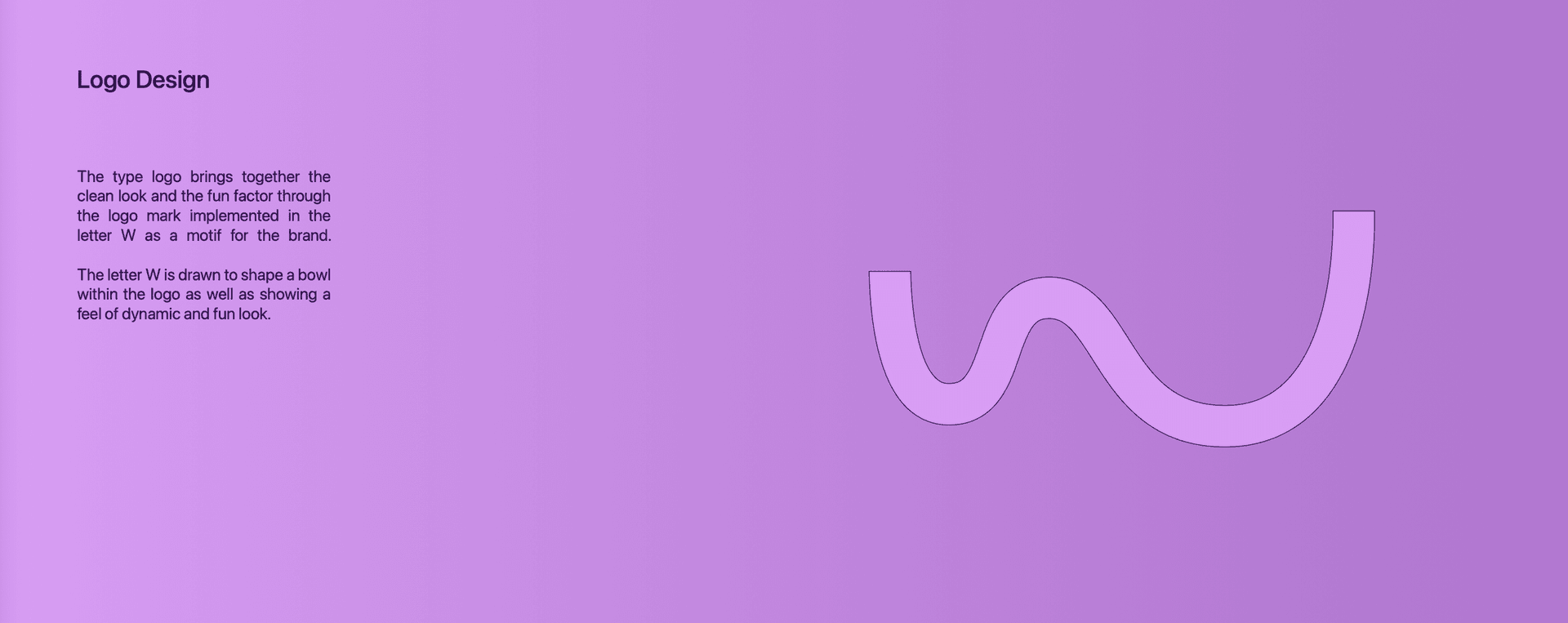
The W in Bowl is drawn as a bowl.
How I thought
The logotype keeps the type clean and lets one letter carry the fun. I drew the W as a curved bowl, so the name shows what it is. That single stroke became the brand motif: soft, dynamic and easy to recognise on its own.
02
Colour & pattern
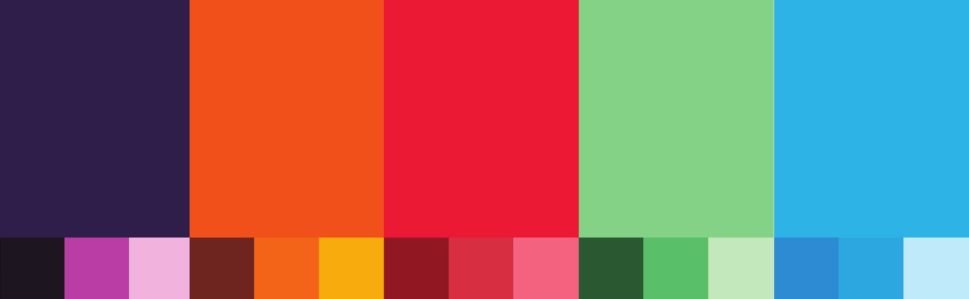
One shade family for every flavour.
How I thought
The palette is vibrant so the brand pops, with a range of shades so each flavour gets its own colour family. Complementary colours sit next to each other on purpose, for contrast and energy.
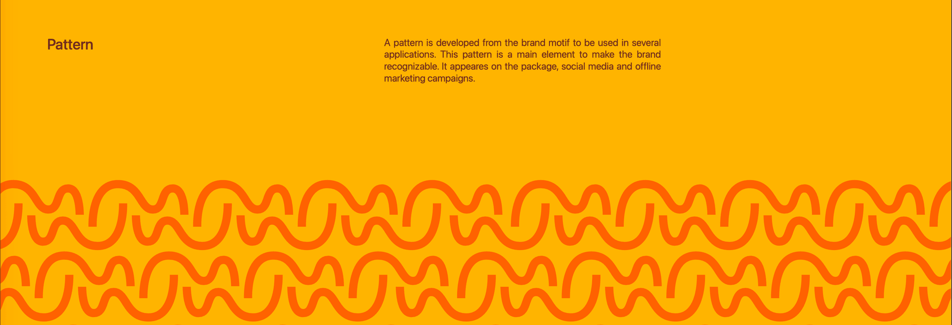
I repeated the W motif into a pattern. It runs on the packs, on social media and in offline campaigns, so the brand is recognisable even without the logo.
03
The hands
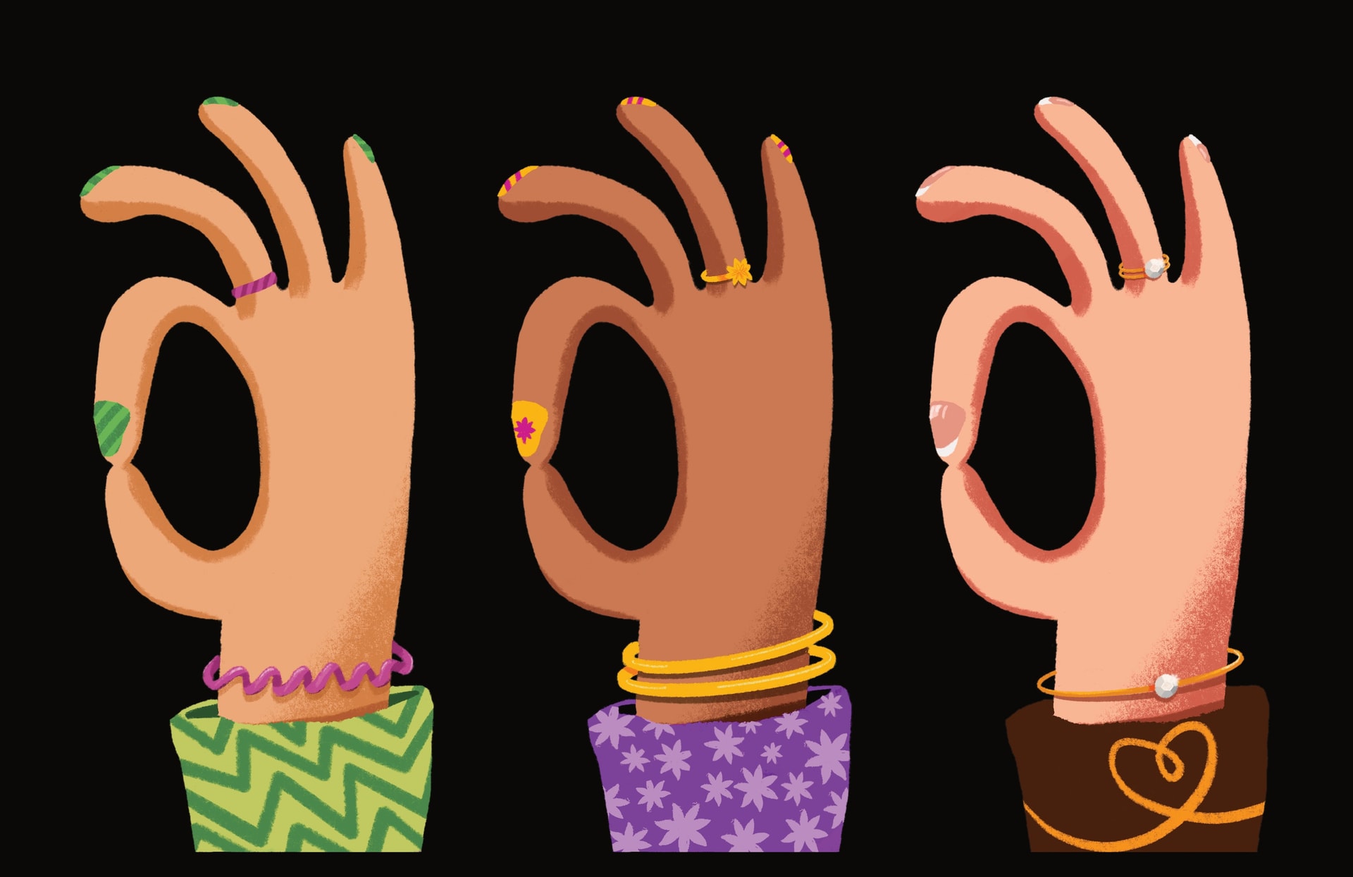
Same gesture, different hand. Every flavour says "good".
How I thought
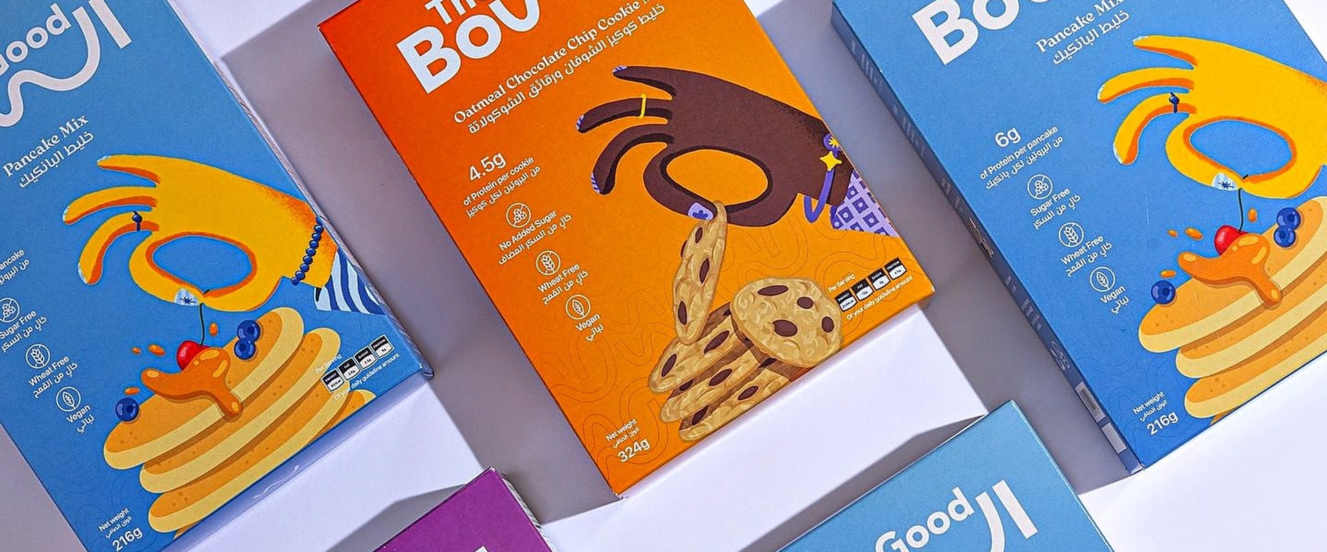
I picked the OK hand gesture because it says the brand name without words: this is good, this is just right. I drew a set of hands to sit on the packs.
Every pack uses the same gesture, but each flavour gets a different skin tone, nail art, rings and bracelets. The family stays together while each product gets its own personality.
One gesture
The OK sign carries the name: good, just right.
Many hands
Different skin tones and accessories tell the flavours apart.
Hand-drawn
Textured brushwork keeps it warm, human and playful.
04
Packaging
What I designed
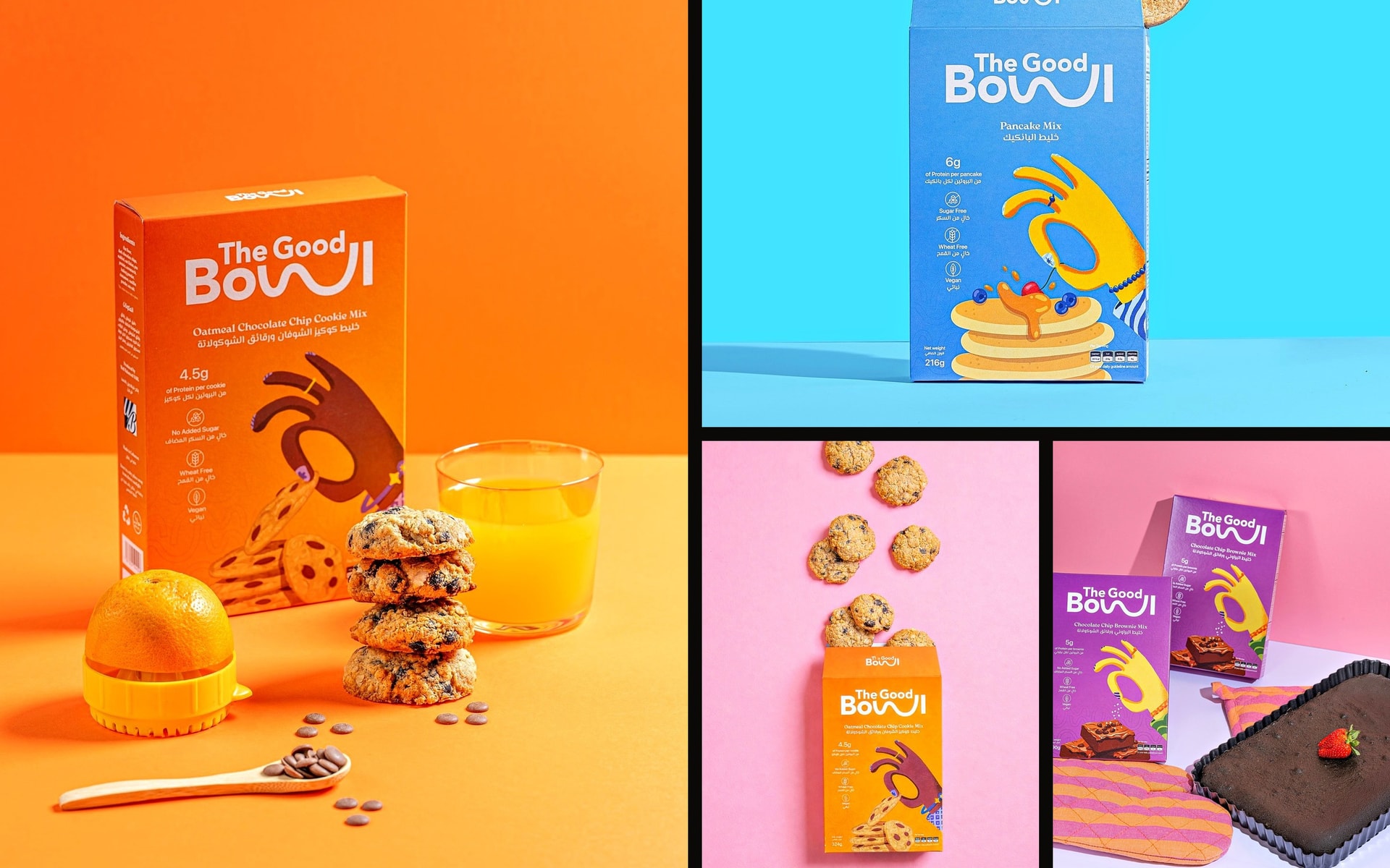
The cereal line and the baking mixes share the same system: a tilted logo, the hand holding the hero ingredient, and a full colour field per flavour. Brownies go purple, cookies go orange, pancakes go sky blue.
Each pack carries its key facts in English and Arabic for the Lebanese shelf.
05
Out in the world
How it lives
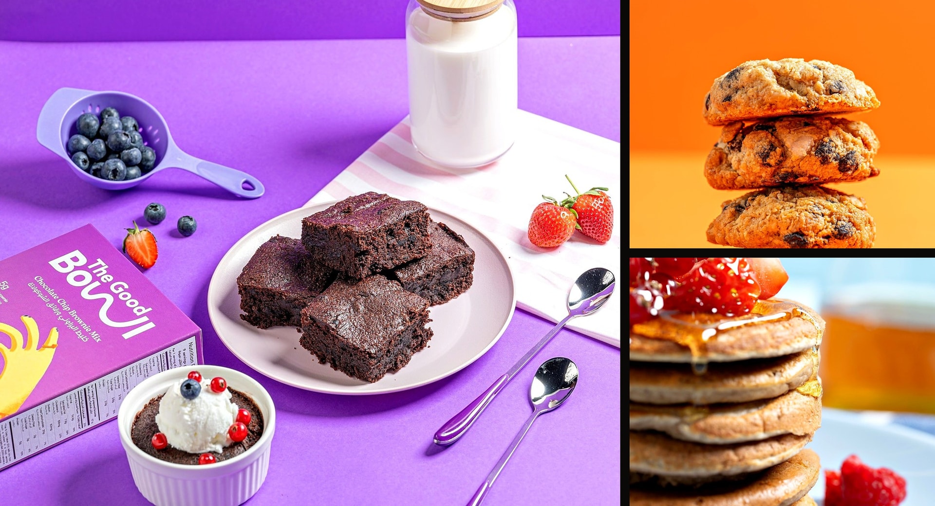
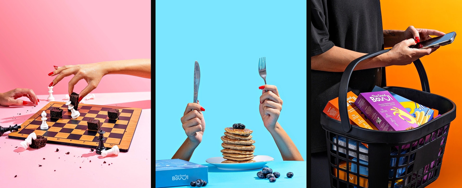
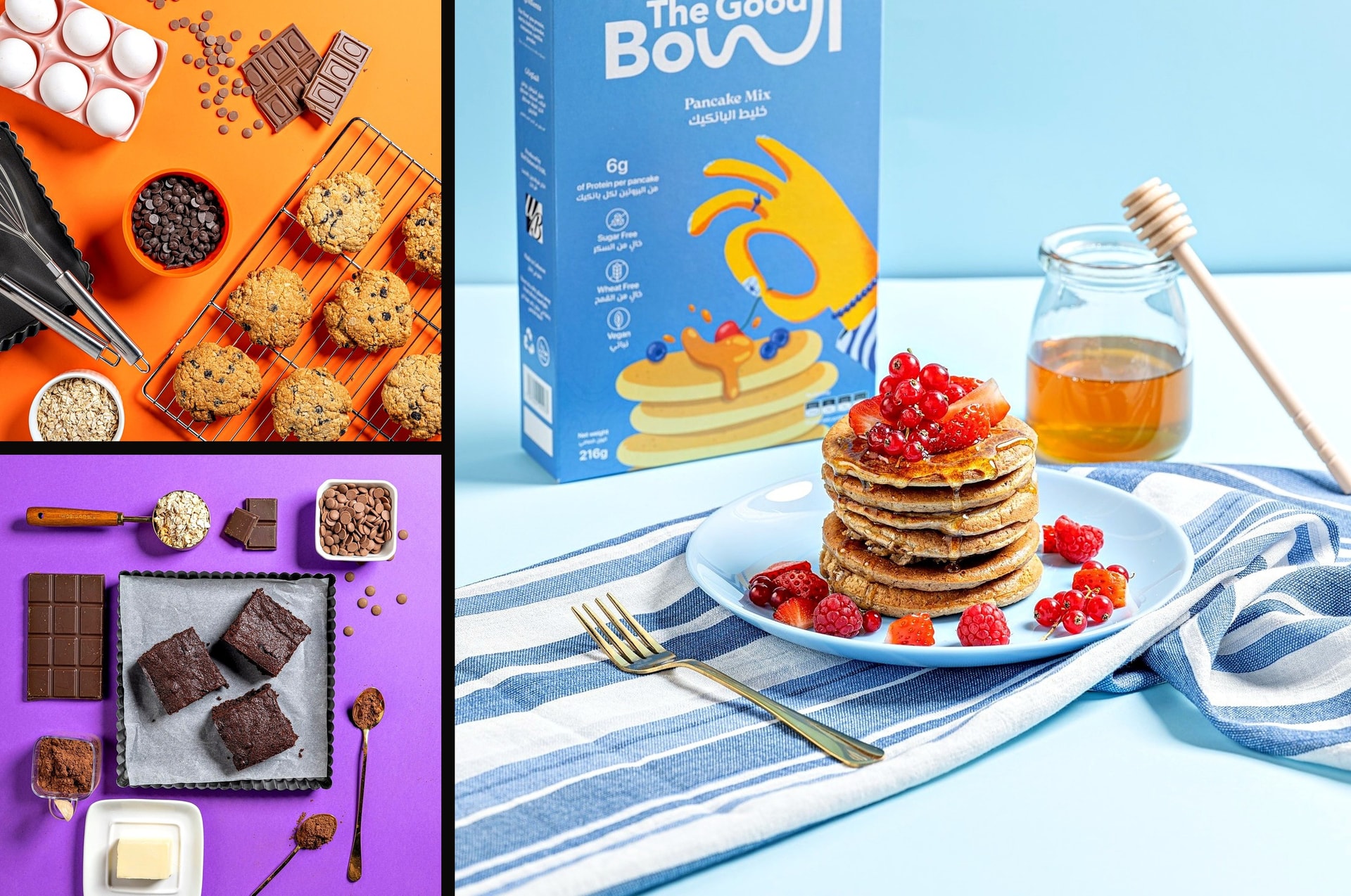
After launch, the brand's colour system carried straight into the photography. Every flavour keeps its own colour field: purple for brownies, orange for cookies, sky blue for pancakes. The food sits in the middle, and the packs and the OK hands sign off. The same playful tone runs through it, from a brownie chess game to a pancake stack with knife and fork raised.
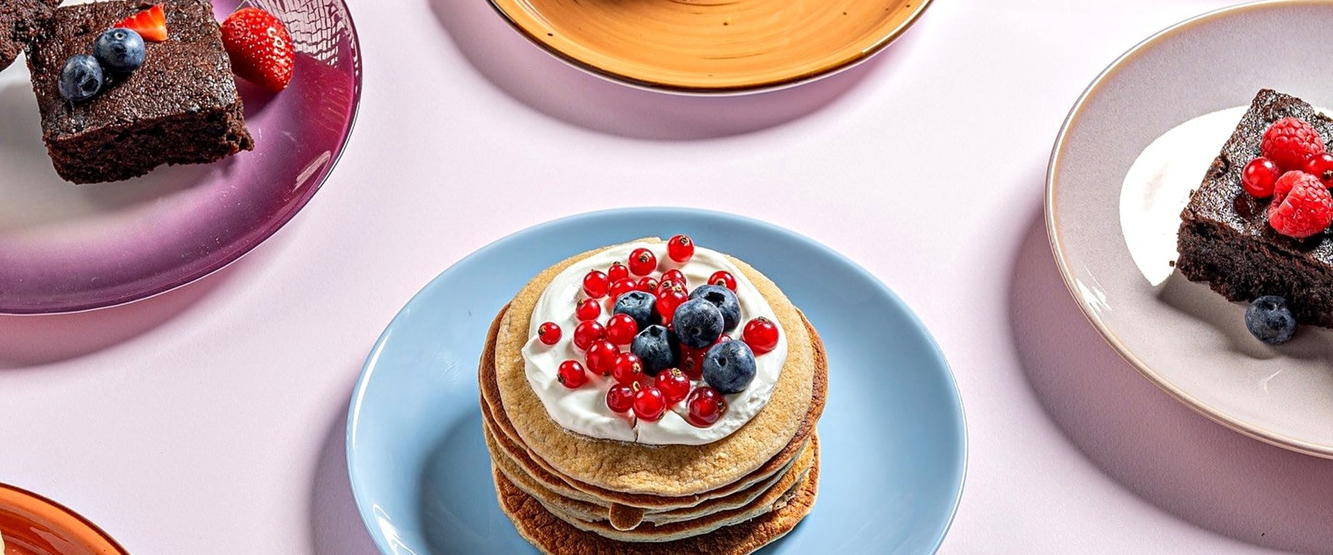
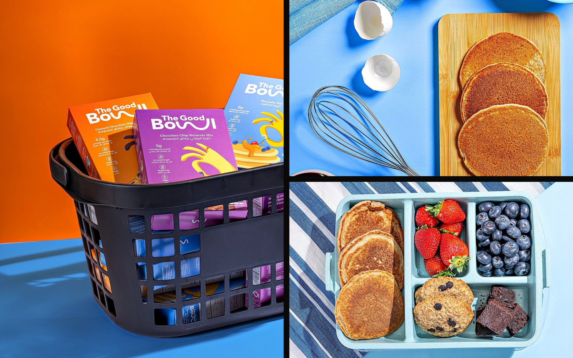
Product photography: The Good Bowl.
Outcome
A complete brand, from the name to the shelf, made solo as a freelancer. The Good Bowl launched in Lebanon with its logo, motif, palette, pattern, hand illustrations and packaging for two product lines. The system is simple at its core and open enough to add new flavours and products as the range grows.