Client & agency
Remat, Riyadh
with Singularity KSA
My role
Brand identity designer & key visual artist
Scope
Logotype, brand mark, colour, Sadu patterns, posters, key visuals, tickets, outdoor
The brief
Remat is a theatre show set across two worlds. One is a world of people. The other is a world of camels. They live on the same timeline, running side by side, and they have never met.
Then one man meets a camel for the first time, and the story begins between them.
The show was planned for Riyadh during the Year of the Camel 2024. It needed a name, a mark and a look that could tell that story before the curtain opens.
My role
What I did
The name
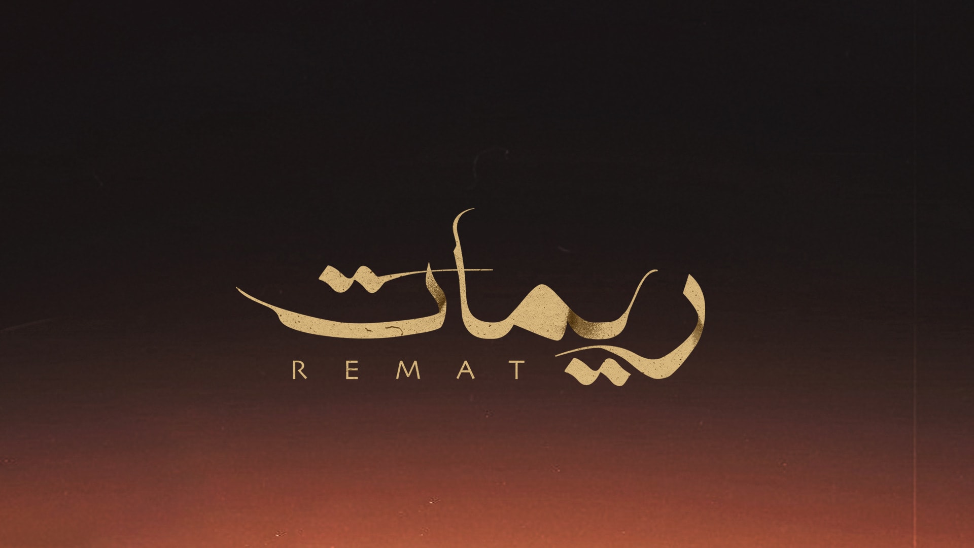
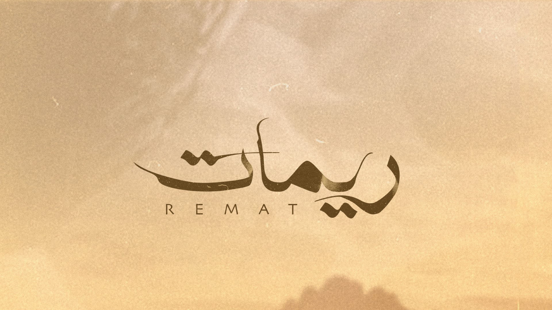
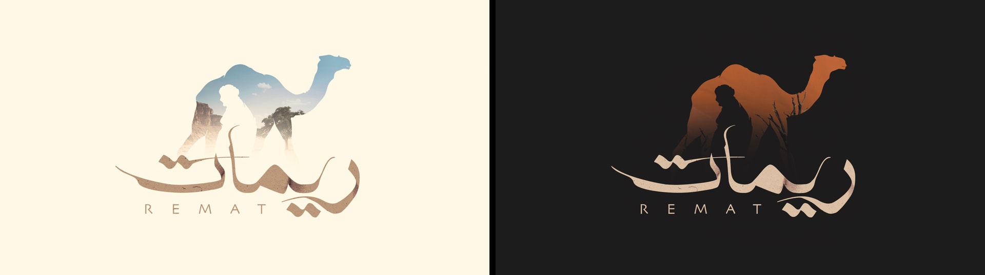
I built Remat as a calligraphic logotype, textured by the rock and sand of the Arabian Peninsula.
The mark
One silhouette that holds both main characters, each one facing the other way.
The world
Three colourways, a Sadu pattern system, posters and key visuals, then tickets and outdoor.
The idea
Two worlds on one timeline. Side by side, and they had never met.
That is the heart of the show, so I made it the heart of the identity. Every piece holds two things that belong together and still stand apart.
01
The logotype
How I thought
I wanted the name to feel like it came out of the land. The strokes take their texture from the rocks and sands of the Arabian Peninsula, worn and grainy like stone.
Through them I added fine, human lines. They give the logo the magical feel of a story told on stage, and they put a person inside the landscape.
Written in rock and sand. A name that feels like it came out of the land.
Rock & sand
The strokes carry the grain of stone and the drift of the dunes.
Human lines
Fine lines run through the letters, like a person crossing the landscape.
Arabic leads
REMAT sits underneath in wide, quiet capitals, so the Arabic always comes first.
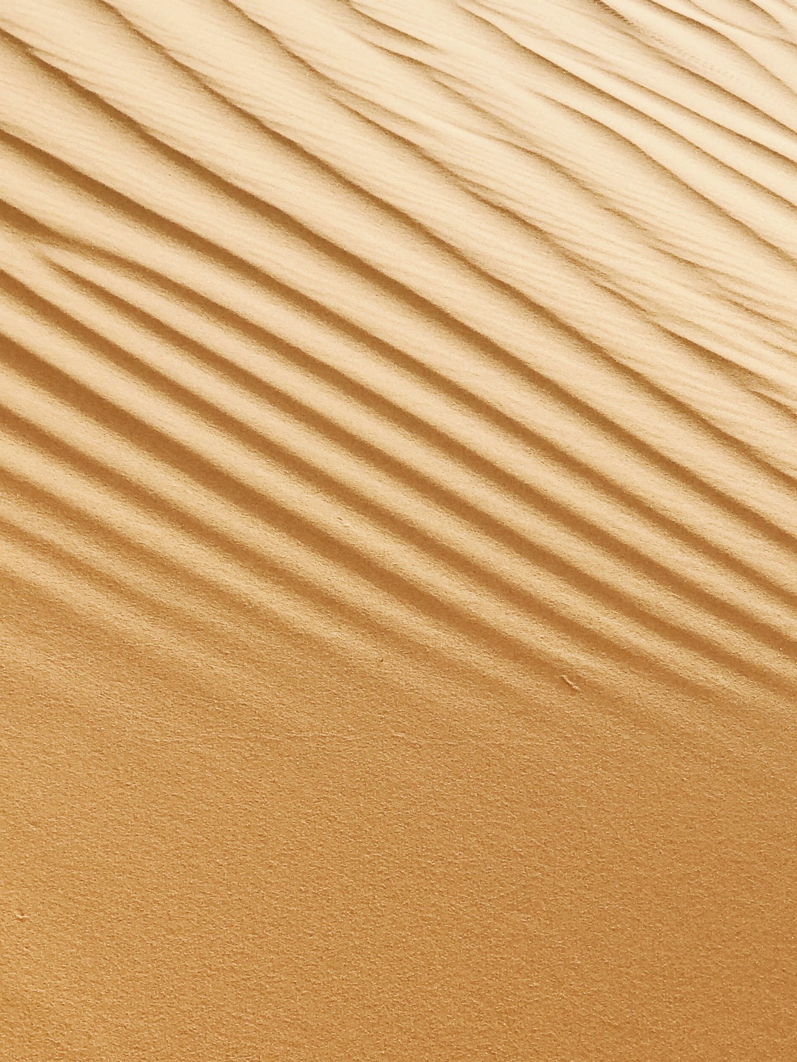
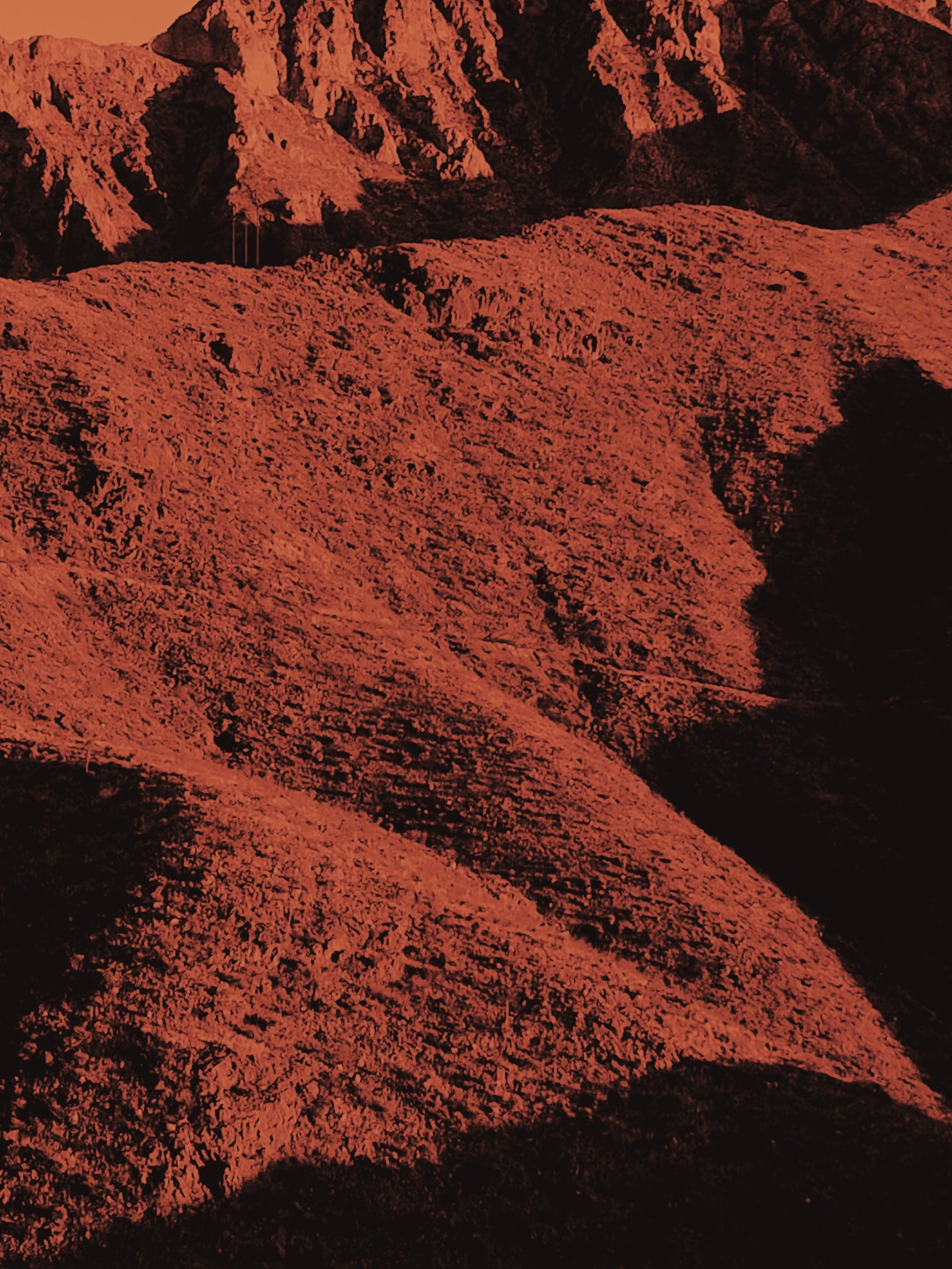
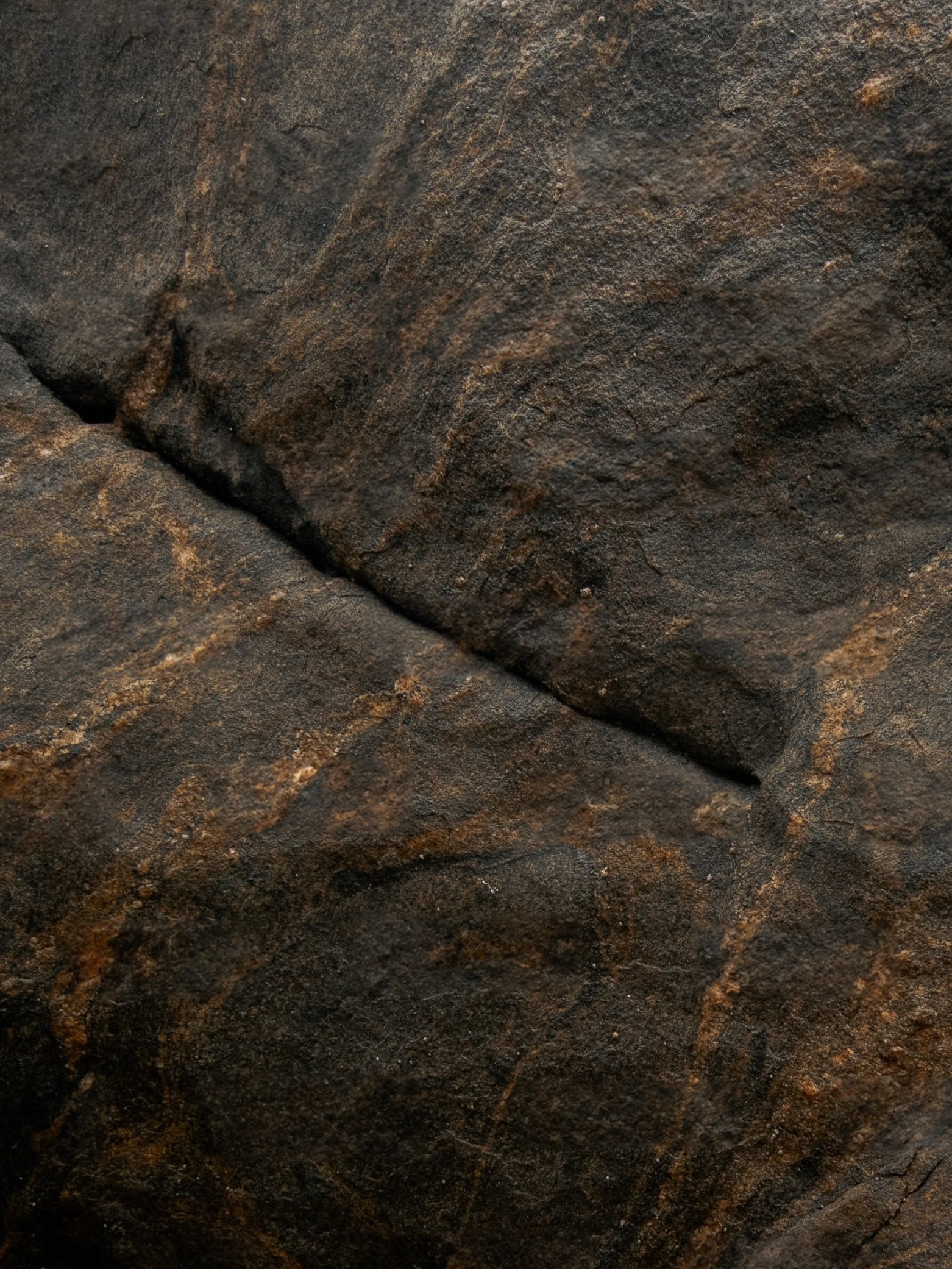
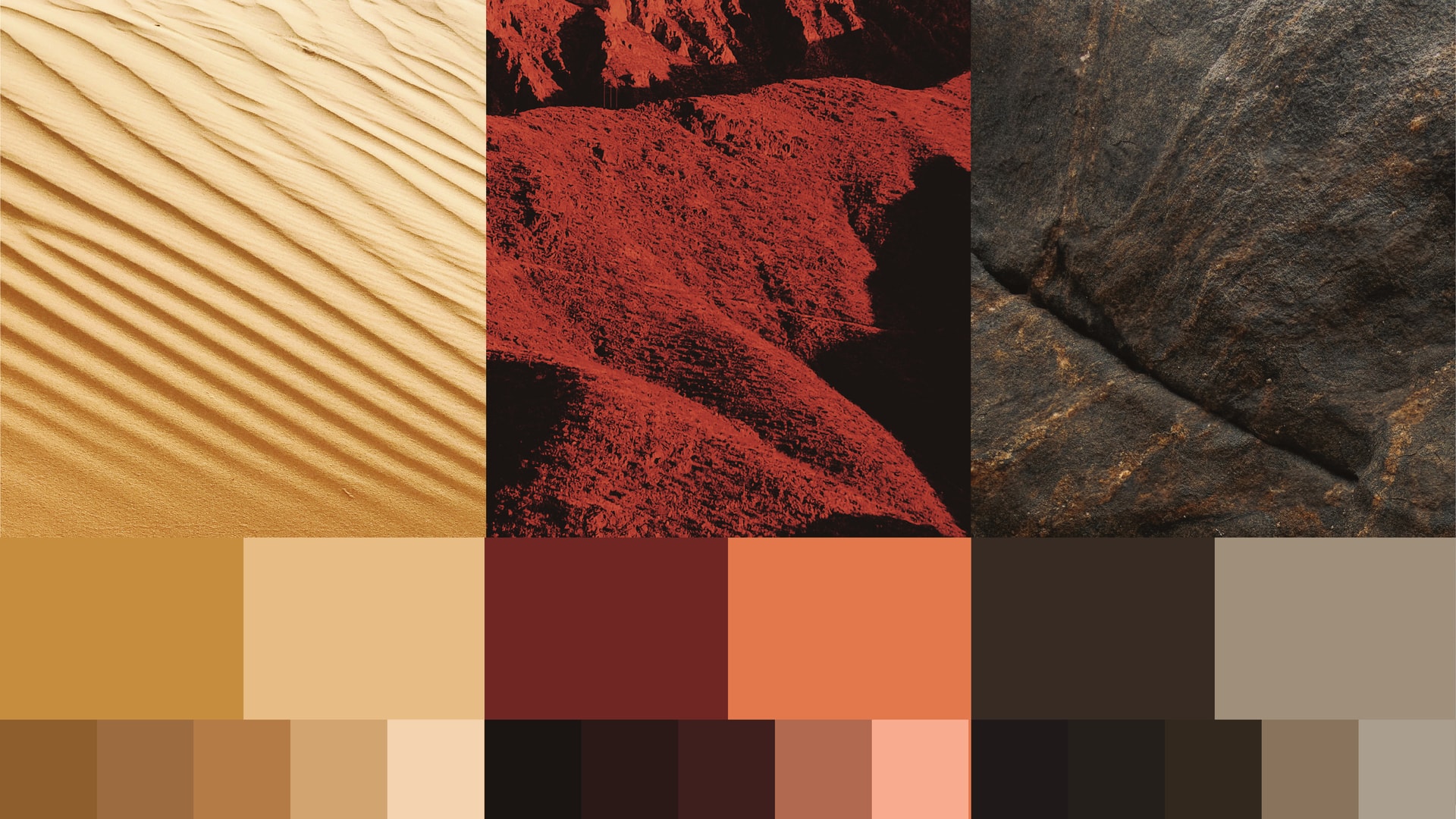
Sand, red mountain and dark rock. The three textures behind the logo, and later the palette.
02
The brand mark
Two characters, one shape
The mark comes straight from the plot. I drew the silhouettes of the two main characters, the man and the camel, inside one shape.
Each one moves in the opposite direction. They share the same space and the same outline, and still they have never met. That is the whole show in one mark.
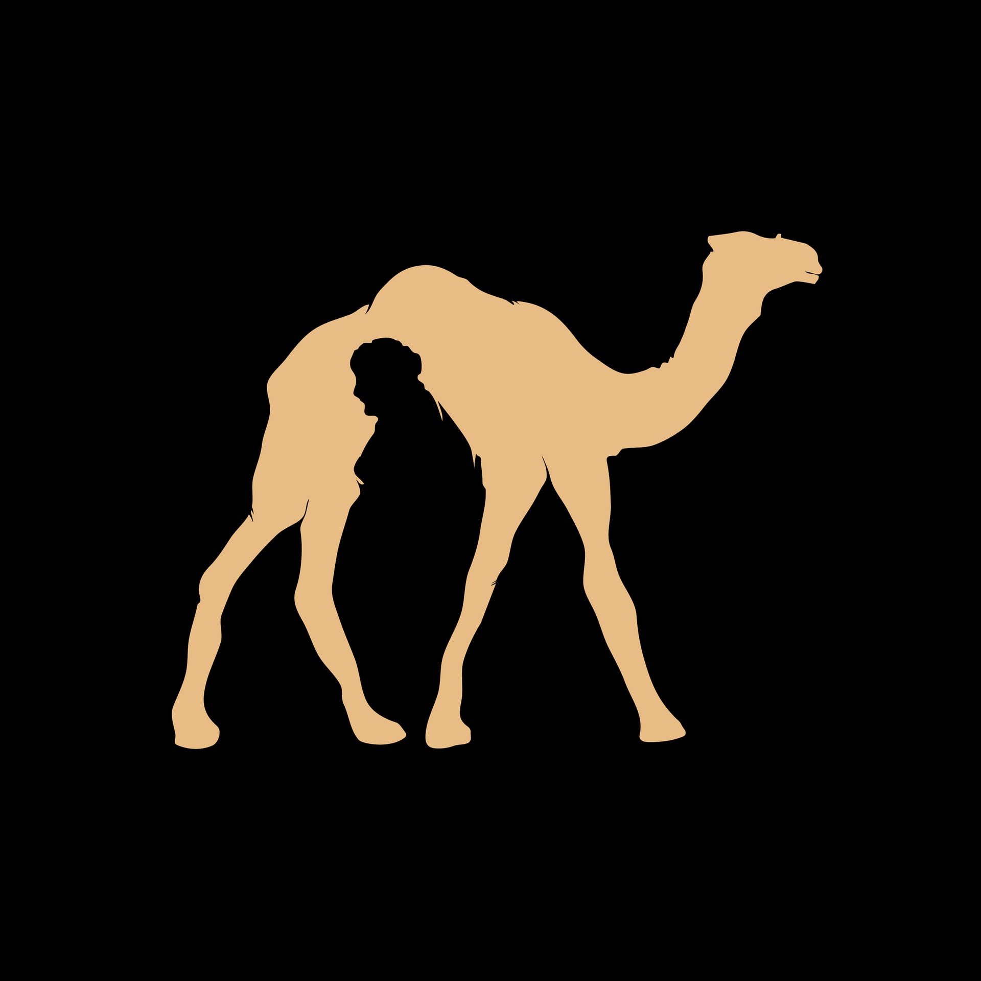
The whole plot in one silhouette.
03
Colour & pattern
How I thought
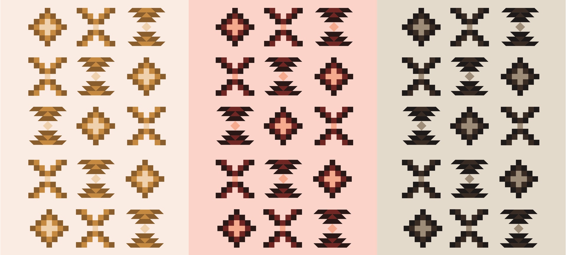
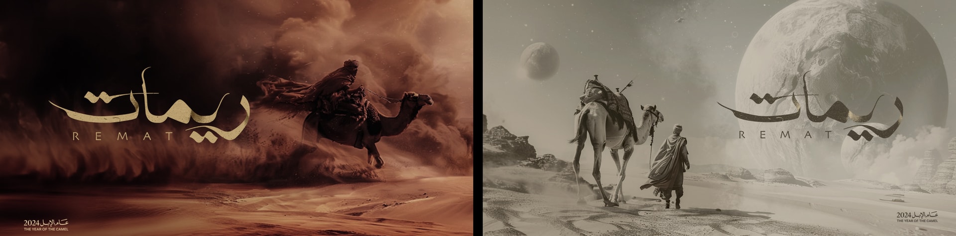
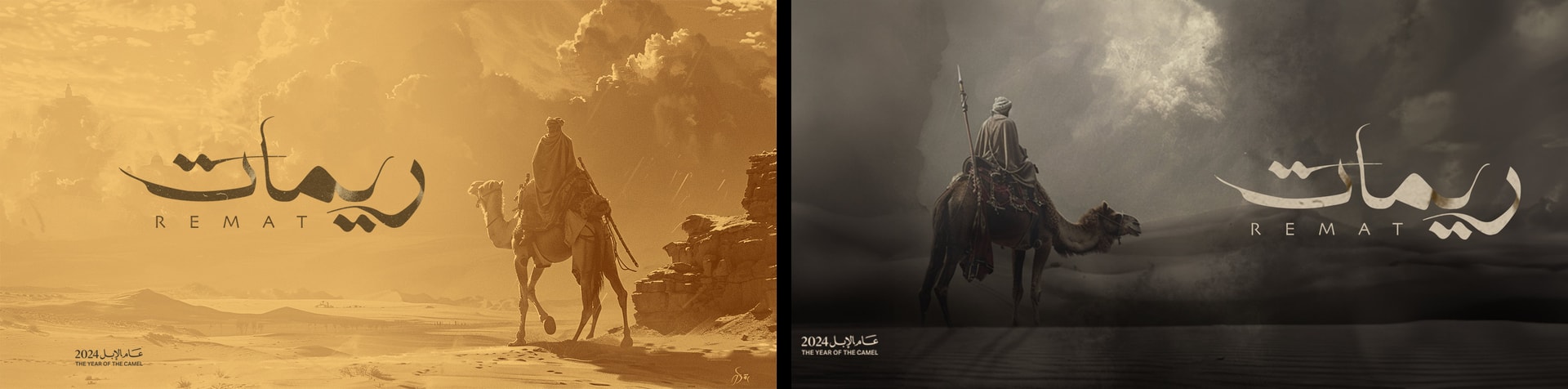
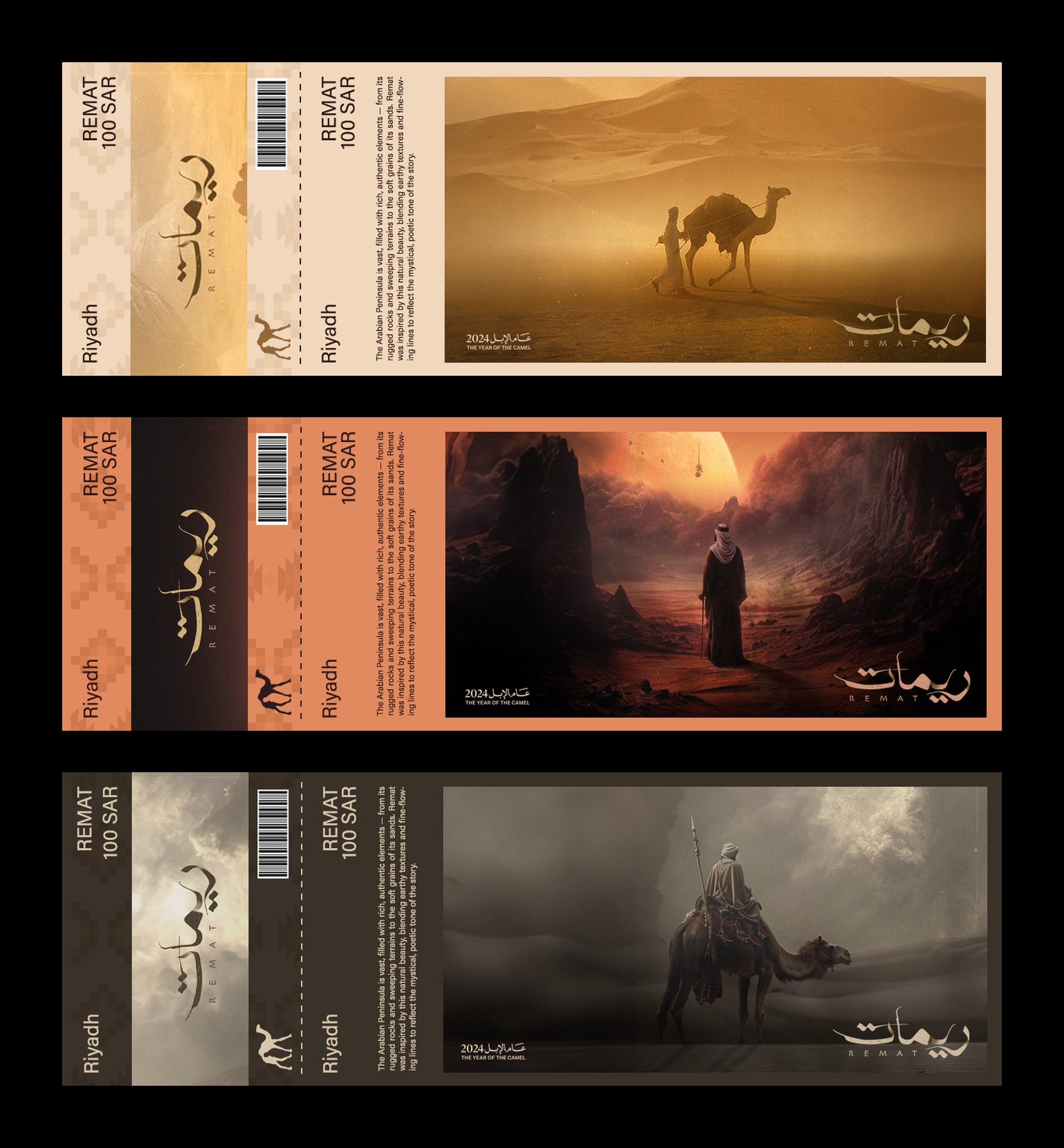
Each texture became its own colourway: golden sand, red mountain and dark stone. Every touchpoint comes in all three, so the posters, tickets and screens read as one family with three moods.
The patterns come from Saudi Sadu weaving. I kept the sharp, stepped lines of rock and sand, and made a version for each colourway.
Golden sand, red mountain, dark stone. Three moods of the same land.
How I thought
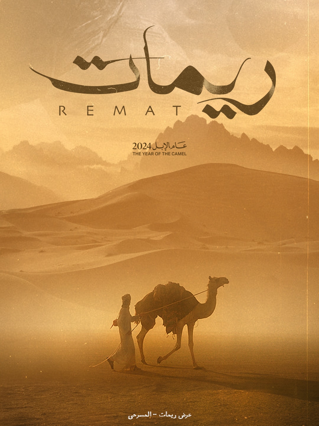
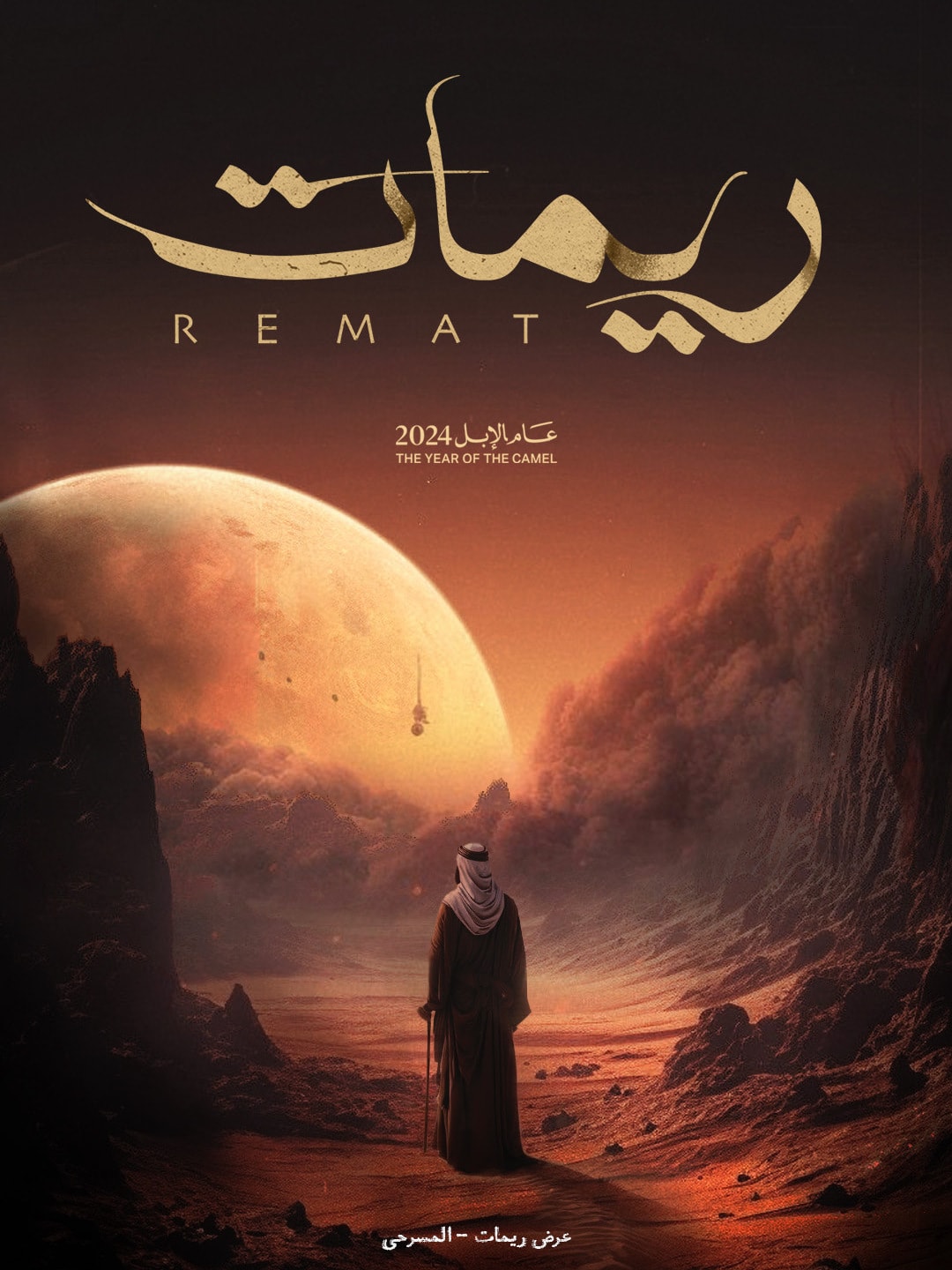
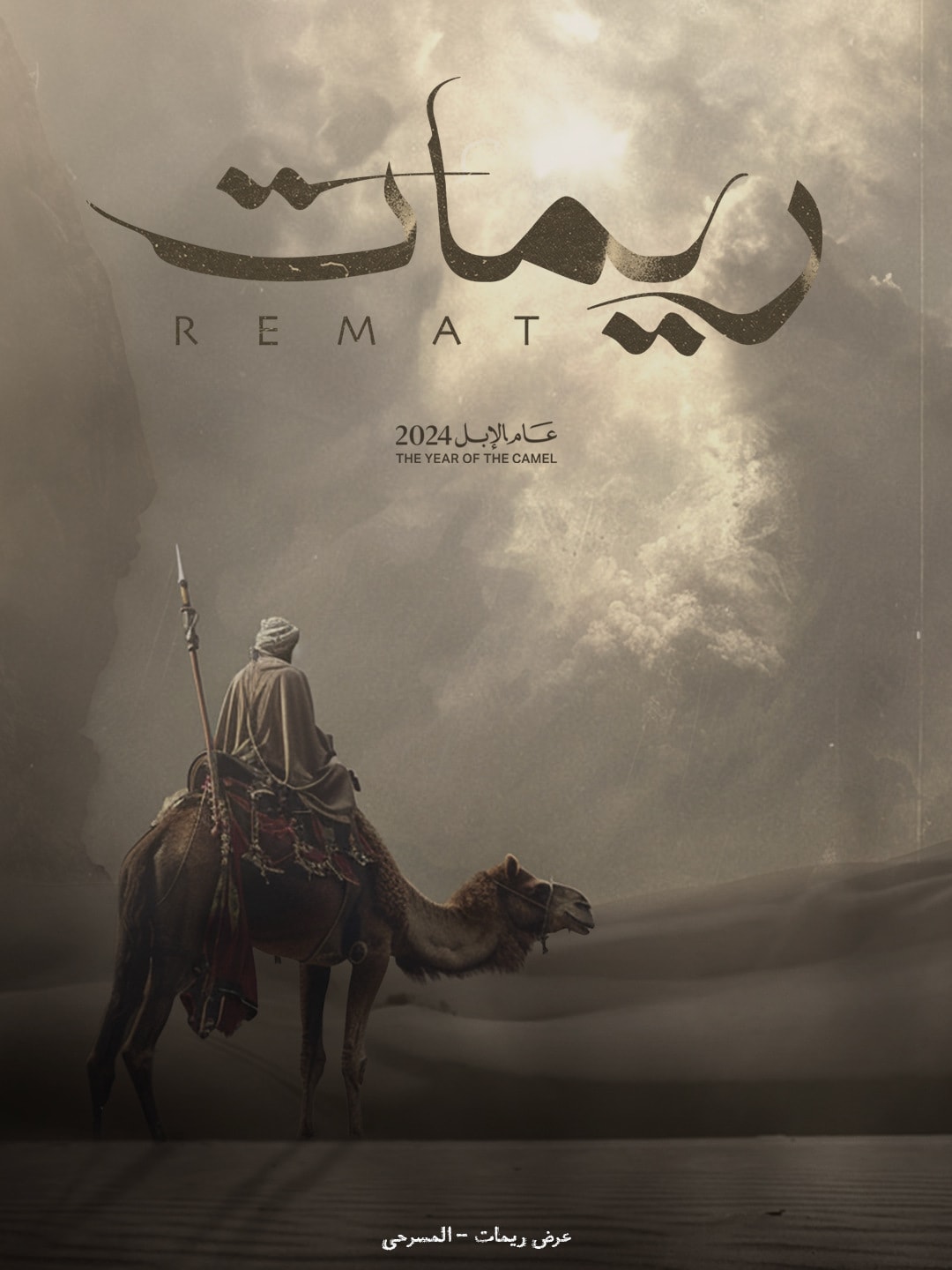
I made the key visuals to put the story on a poster. A lone man, a camel, a desert under a moon too big for our sky. The two worlds are always in the frame, but never quite together.Each visual lives in one of the three colourways, so the campaign changes mood and still stays one campaign.
A desert slightly out of this world.
05
Touchpoints
Craft
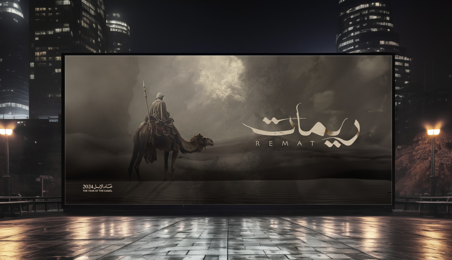
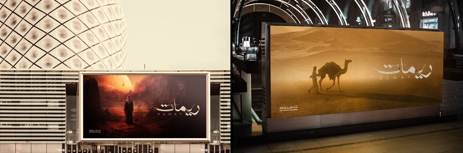
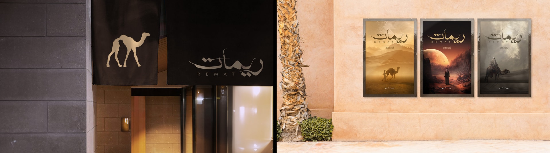
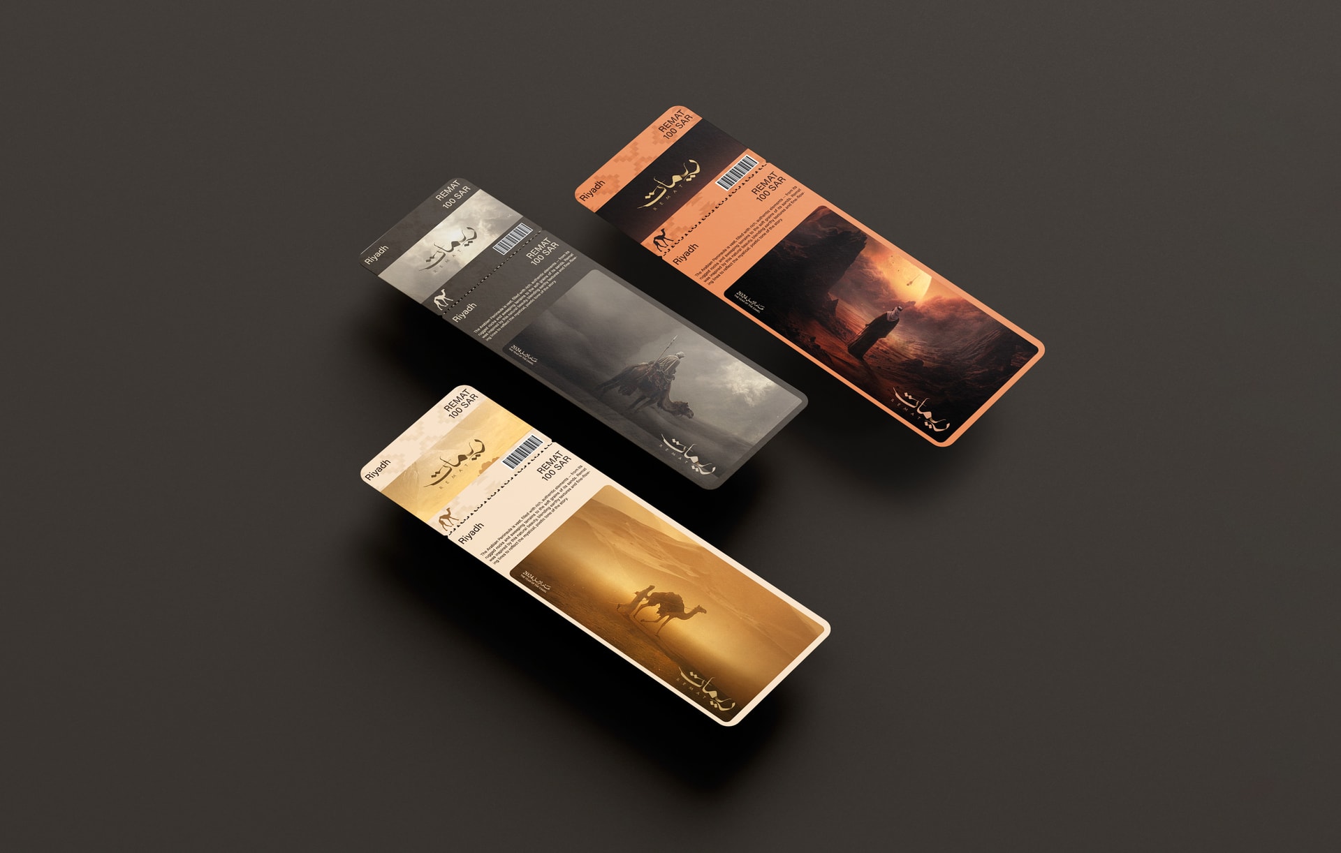
I carried the system onto billboards, digital screens, entrance banners and posters. On the tickets, the Sadu pattern, the camel mark and a key visual sit together, in all three colourways.
From billboard to ticket stub.
Outcome
A complete identity concept for Remat, built around the show's own plot: a logotype made from the land, a mark that tells the story in one shape, three colourways and a campaign ready to run from billboards to the ticket in your hand.